Showing posts with label frequency tables. Show all posts
Showing posts with label frequency tables. Show all posts
Tuesday, May 10, 2016
The five number summary and frequency tables
Let's say we have the length of a list n. We know how to find the position of the median once everything has been put in order by the formula (n+1)/2. That is because the list starts at position 1 and ends at position n. Let's see how we can use this to find the positions of Q1, the median of the low half of the data, and Q3, the median of the high half of the data.
Assume n = 27 and the data is in order from low to high. (27+1)/2 = 28/2 = 14, so the median is in position 14.
Q1: The low half of the data is in positions 1 through 13, so (13+1)/2 = 14/2 = 7, and Q1 is in position 7.
Q3: The high half of the data is in positions 15 through 27. (15+27)/2 = 42/2 = 21, and Q3 is in position 21.
Another example when n = 42.
(42+1)/2 = 21.5, so the median is the average of the values in positions 21 and 22.
Q1: The low half of the data is in positions 1 through 21, so (21+1)/2 = 22/2 = 11, and Q1 is in position 11.
Q3: The high half of the data is in positions 22 through 42. (22+42)/2 = 64/2 = 32, and Q3 is in position 32.
Let's see if we can use this information with a frequency table. The first number is the value and the second number is the frequency.
12, 5
11, 4
10, 3
9, 4
8, 2
7, 4
6, 3
5, 1
4, 2
3, 2
2, 2
The sum of the frequencies is 32. The position of the median is at (1+32)/2 = 16.5, between positions 16 and 17.
In this data set ordered from top to bottom, the positions 1 to 16 have the high half of the data and the positions 17 to 32 have the low half. All this does is change which quartile is at which position, not the method of finding the quartile.
Q1: The low half of the data is in positions 17 through 32, so (17+32)/2 = 49/2 = 24.5, and Q1 is between positions 24 and 25.
Q3: The high half of the data is in positions 1 through 16. (1+16)/2 = 17/2 = 8.5, and Q3 is between positions 8 and 9.
We now need to find the values in the positions 8 and 9, 16 and 17 and 24 and 25. Here is the list with the positions added in. An asterisk (*) will mark the important values
12, 5 positions 1 through 5
11, 4 positions 6 through 9 *
10, 3 positions 10 through 12
9, 4 positions 13 though 16 *
8, 2 positions 17 and 18 *
7, 4 positions 19 through 22
6, 3 positions 23 through 25 *
5, 1 position 26
4, 2 positions 27 and 28
3, 2 positions 29 and 30
2, 2 positions 31 and 32
Median: there is a 9 in position 16 and an 8 in position 17. We take the average of 8 and 9 and get 8.5 as the median value.
Q1: The is a 6 in both position 24 and 25. The average of 6 and 6 is 6.
Q3: Likewise, there is an 11 in both position 8 and 9. The average of 11 and 11 is 11.
On this list, it was just a coincidence that the median was not a whole number and the two other quartiles were nice round numbers. Any time a quartile is between two positions, there is a chance it will be the average of two different values.


Tuesday, November 3, 2015
The frequency table solution for TI-83 and TI-84
Put the list of numbers in one list (let's say L1) and the frequencies in a separate list (for simplicity's, make it L2 in this example.) Under the STAT menu, in the CALC sub-menu, choose
2-Var Stats L1, L2
Assuming the frequencies are in the second list, the sum of the y values is n, the size of the sample and the sum of the xy is the sum of all the x values. You then need to divide (sum of xy)/(sum of y) to get the average x-bar.
As for the median, you have to do it by hand, just like the folks with the TI-30xIIs.
Here are the lists from class, the first number x and the second number f(x). The answers are in the comments.
This year's daily differences, 2015 - (avg. 1999-2014)
-9, 1
-8, 3
-7, 4
-6, 7
-5, 13
-4, 15
-3, 12
-2, 16
-1, 11
0, 24
1, 27
2, 24
3, 24
4, 25
5, 18
6, 14
7, 11
8, 8
9, 14
10, 5
11, 7
12, 1
13, 1
14, 4
15, 2
16, 3
17, 5
18, 4
20, 2
21, 1
Here is the list of wins by NFL teams in 2014
12, 5
11, 4
10, 3
9, 4
8, 2
7, 4
6, 3
5, 1
4, 2
3, 2
2, 2
Answers in the comments.
Saturday, February 8, 2014
Notes for 4 February 2014

The two formulas here are standard deviations for a numerical data set. When we have a sample, we use sx. When the data set is a population, we use sigmax. We get two different values because the denominator in the first case is n-1 and N in the latter case. The reason for this is degrees of freedom.
The idea of degrees of freedom is to count how much information you need to get an answer. For example, if a football game ends in regulation we know that
final score = score in 1st + score in 2nd + score in 3rd + score in 4th
There are five pieces of information, but if you have any four of these numbers, you can find the fifth. Here we would say the degrees of freedom are 4, which is 5-1. For example, if we know the Seahawks scored 43 points total in the Super Bowl, and the scored 8 points in the first quarter, 14 points in the second quarter and 14 points in the third, we can figure out how much they scored in the 4th quarter without being told.
score in 4th = final score - score in 1st - score in 2nd - score in 3rd = 43 - 8 - 14 - 14 = 7
This is a situation where the degrees of freedom are n-1, just like with the standard deviation of the sample. The idea is that if we know the average and somehow we get all the scores except for one, we can find the last score by multiplying the average by n then subtracting all the scores we know to find the one score we don't know.
A new way to measure data: z-scores

We can compare two sets of data against one another using the averages (x-bar or mux) and the standard deviation (sx or sigmax) with a formula known as the z-score. We subtract the average from the raw score x. If x is above average, we will get a positive number, if x is below average, we will get a negative number. (if x is exactly at teh average, we'll get zero.) We then divide by the standard deviation to get the z-score. This tells us how many standard deviations we are away from average, either high or low.
Here is an example using the American and National League final standings last year. The data set we will check out is the number of wins. I will treat both leagues as samples of all of Major League Baseball and the reason there is a difference in the average wins is because of inter-league play.
American League:
x-bar = 81.3
sx = 13.7
National League:
x-bar = 80.7
sx = 11.1
The AL had slightly more wins, but their standard deviation is higher because the data is more spread out, largely because the Houston Astros were so terrible. In any data set, we can use z-scores to find outliers.
z is greater than 3: The score is very unusually high
z is greater than 2: The score is unusually high
z is less than -3: The score is very unusually low
z is less than -2: The score is unusually low
The Astros had 51 wins, so their z-score is (51-81.3)/13.7 = -2.21. They are the only team in either league that can be considered an outlier, either high or low.
We can also compare teams in the different leagues. For example, both the As and the Braves had 96 wins, but because they are in different leagues they won't have the same z-score.
z-score for As: (96-81.3)/13.7 = 1.07
z-score for Braves: (96-80.7)/11.1 = 1.38
What this would say is that it was more impressive for the Braves to win 96 that for the As. A big part of this is that the Athletics played 19 games against the Astros, winning 15 and losing 4. The Braves never played the Astros, and that alone meant they got the same number of wins against a tougher set of opponents, which accounts for their higher z-score.
Z-scores in normally distributed sets

Not every set can be assumed to be normally distributed. Usually, we will be told a set is normally distributed and be given both mux and sigmax. If we have such a set, we can take a raw score and turn it into a percentile using the look-up table we got on the orange hand-out on Tuesday. Let's take an example.
It is assumed that IQ scores are normally distributed, where the average is 100 and the standard deviation is 15. This would say an IQ of 110 has a z-score of (110-100)/15 = 0.67. Because of our assumption, we can use the look-up table to find the percentile for an IQ of 110.
1. Use the Positive z-score side
2. Look in the row next to the 0.6 label in bold
3. Look in the column labeled 0.07.
The value at that position on the table is .7486. What this means is that 74.86% of the population has an IQ of 110 or less. If we subtract 74.86% from 100%, we get 25.14%. Rounding to the nearest percent, this means the 110 IQ is at about the cutoff for the 75th percentile.
We will discuss this in greater detail on Tuesday, February 11.
Wednesday, January 29, 2014
Notes for 28 January 2014
Frequency tables
On last Thursday, we took a first look at stem and leaf plots, a method for writing a data set using less space and less ink (or if we are on the Internet, less bandwidth). For some data sets that have a lot of duplication, we can use a frequency table, where the numerical values x are matched up with their corresponding frequencies f(x). Here is an example using hockey scores.
x || f(x)
7 || 1
6 || 1
5 || 3
4 || 4
3 || 6
2 || 2
1 || 3
0 || 2
This set isn't that big, so let me write it out as a list in order.
7, 6, 5, 5, 5, 4, 4, 4, 4, 3, 3, 3, 3, 3, 3, 2, 2, 1, 1, 1, 0, 0
If we want to find the standard statistics for mean, median and mode, and the length of the list n, here are the methods.
Length of list n. we take the sum of the f(x) column.
x || f(x)
7 || 1
6 || 1
5 || 3
4 || 4
3 || 6
2 || 2
1 || 3
0 || 2
||22
The list has 22 values. We can use this to find mean and median.
Mode. Mode is easy using a frequency table, we see the biggest f(x) is 6 and it corresponds to x = 3. That means the mode is 3, the number that shows up most often.
Mean. We need to know the sum of all 22 values. For this we need to multiply x*f(x). The idea is that there is one 7, so that adds 7 to the total, but there are three 5s, so that adds 15 to the total.
x || f(x) || x*f(x)
7 || 1 7
6 || 1 6
5 || 3 15
4 || 4 16
3 || 6 18
2 || 2 4
1 || 3 3
0 || 2 0
||22 || 69
The average or mean is 69/22 = 3.1363636... Since the data is all whole numbers, we round the average to the nearest tenth, which we would write as x-bar = 3.1
Median. To find the median, we need to find the median position, which is always (n + 1)/2. In this case, that is (22+1)/2 = 23/2 = 11.5. The median will be the average of the 11th and 12th numbers on the list. Here's how we find those numbers using the frequency table.
x || f(x) || positions
7 || 1 1
6 || 1 2
5 || 3 3 through 5
4 || 4 6 through 9
3 || 6 10 through 15
2 || 2 16 through 17
1 || 3 18 through 20
0 || 2 21 through 22
I went to the end of the list, but I could have stopped as soon as we knew that the value 3 was in positions 10 through 15. That means the 11th number is a 3 and so is the 12th number. The average of 3 and 3 is
(3+3)/2 = 3.
In this case, the median is 3.
Relative frequencies
We are now dealing with proportions, and the formulas are as follows:
Population: p = F/N
Sample: p-hat = f/n
We often want to compare one proportion to another, either two from the same sample or comparable proportions from different samples, or the sample proportion to the population proportion. Because of this, it is better to write the numbers as decimals or in scales based on powers of 10.
Scales based on powers of 10: The most famous scale base on powers of ten in percentage, which really means "per 100". It is much more common to see "53% of the people agree with the president's plan" than ".53 of the people..." or "53 out of every 100 people...". Technically, all those phrases are saying the same thing, but percentage is the most popular.
One of the places where decimals are used for proportions is in the sports pages. A batting average in baseball (hits/at bats) is given as a percent to three decimal place, and likewise winning proportions (win/total games) are written as .xxx. If a batter has 27 hits in 92 at-bats, the batting average 27/92 = .293478261... is shortened to .293 and pronounced "two ninety three". Likewise, a team who has won 17 games and lost 5 will have a winning proportion of 17/22 = .77272727... = .773, and often stated as "team has a winning percentage of seven seventy three." Technically, this is a mistake, because "percentage" means out or 100. The correct word from the dictionary, which no one ever uses, is "permillage", which means out of 1,000. The team in question would have a winning percentage of 77, and a winning permillage of 773.
In both of the cases from the sports pages, the greater number of place after the decimal is used to break ties. For example, a team with 14 wins and 4 losses is at .778, which is better than 17 wins and 5 losses, while 20 wins and 6 losses is at .769, so is slightly worse.
To get a number based on a power of 10 scale, you take the proportion and multiply by the power of ten, so it is either p*scale or p-hat*scale, depending on population or sample. Besides greater precision for breaking ties, sometimes we need greater precision because the proportions are so small.
When I ask a class what is the legal limit for blood alcohol while driving, invariably someone will say "point oh eight" and most people will agree. But .08 is wrong. .08 = 8%, and the correct answer is .08% = .0008. I don't blame the students. The number is badly represented and it is an easy mistake to make. Let's take a look at the number on other scales of 10.
.08 out of 100 is the same as
.8 out of 1,000 0r
8 out of 10,000 or
80 out of 100,000
80 parts out of 100,000 is a tiny proportion. To give an idea, ounce of pure alcohol mixed into ten gallons of blood would give you 78 parts out of 100,000, and most people have between a half gallon and a gallon and a half of blood in their body, between 4 and 12 pints. The amount of alcohol in a person's blood stream that is over the legal limit is about the same amount of alcohol as found in a capful of mouthwash used after brushing your teeth.
We will be dealing with much smaller proportions later in the class, where there are things that can be hazardous to your health at ranges measure in parts per billion, but for now, we will look at the per 100,000 scale for another type of statistic, measurements of mortality rates.
Here are the number of homicides in some American cities in 2013.
Chicago: 415
New York City: 333
Detroit: 333
Washington, DC: 103
Oakland: 92
This makes it look like Chicago is most dangerous and Oakland is safest, but this doesn't take into account the populations of the cities. Here is the list with populations rounded to the nearest ten thousand.
Chicago: 415 murders, pop. 2,720,000
New York City: 333 murders, pop. 19,650,000
Detroit: 333 murders, pop. 700,000
Washington, DC: 103 murders, pop. 650,000
Oakland: 92 murders, pop. 390,000
Because the number of murders is much smaller than the populations, if we just divide we will get a very small decimal number. For example in Chicago.
415/2720000 = 0.0001525735...
With death statistics, the scale of measurement is usually number per 100,000. To get that, we multiply the answer by the scale 100,000.
0.0001525735... * 100,000 = 15.25735...
Rounding to the nearest tenth, we would say the murder rate per 100,000 people in Chicago last year was 15.3. Here are all the numbers, rounded to the nearest tenth.
Chicago: 415 murders, pop. 2,720,000 15.3 per 100,000
New York City: 333 murders, pop. 19,650,000 1.7 per 100,000
Detroit: 333 murders, pop. 700,000 47.6 per 100,000
Washington, DC: 103 murders, pop. 650,000 15.8 per 100,000
Oakland: 92 murders, pop. 390,000 23.6 per 100,000
Looking at the number on this scale, it is clear that Detroit has a much higher murder rate than the other cities listed Oakland has the second highest murder rate. Chicago and DC are very similar and New York City's rate is very low.
Friday, June 26, 2009
list to frequency table
Here is the list for heights in inches for all students who answered the question in our class survey, put in order from lowest to highest.
60, 60, 60, 61, 62, 62, 63, 63, 64, 65, 65, 66, 66, 66, 66, 66, 66, 66, 66, 68, 68, 69, 69, 69, 70, 70, 71, 71, 71, 72, 72, 74, 76, 77, 78
Only 35 subjects responded, so n = 35.
The frequency table reads as follows
_x____f(x)
60_____3
61_____1
62_____2
63_____2
64_____1
65_____2
66_____8
68_____2
69_____3
70_____2
71_____3
72_____2
74_____1
76_____1
77_____1
78_____1
You can check to see if you have missed any entries by finding the sum of the frequencies, which should be equal to n, which in this case is 35.
60, 60, 60, 61, 62, 62, 63, 63, 64, 65, 65, 66, 66, 66, 66, 66, 66, 66, 66, 68, 68, 69, 69, 69, 70, 70, 71, 71, 71, 72, 72, 74, 76, 77, 78
Only 35 subjects responded, so n = 35.
The frequency table reads as follows
_x____f(x)
60_____3
61_____1
62_____2
63_____2
64_____1
65_____2
66_____8
68_____2
69_____3
70_____2
71_____3
72_____2
74_____1
76_____1
77_____1
78_____1
You can check to see if you have missed any entries by finding the sum of the frequencies, which should be equal to n, which in this case is 35.
frequency table to dot plot and to stem and leaf plot
Here is our frequency table for heights in inches.
_x____f(x)
60_____3
61_____1
62_____2
63_____2
64_____1
65_____2
66_____8
68_____2
69_____3
70_____2
71_____3
72_____2
74_____1
76_____1
77_____1
78_____1
Here is a dot plot using this information.
* * * * * * *
* * * * * * *
* * * * * * *
* * * * * * *
* * * * * * *
* * * * * * * * * * * *
* * * * * * * * * * * * *
* * * * * * * * * * * * * * * * * * *
_____________________________________
6 6 6 6 6 6 6 6 6 6 7 7 7 7 7 7 7 7 7
0 1 2 3 4 5 6 7 8 9 0 1 2 3 4 5 6 7 8
Here is a stem and leaf, with just two stems, 6 and 7.
6 | 000122334556666666688999
7 | 00111224678
We can make a stem and leaf where each of the stems is split into high and low, 60 to 64, 65 to 69, 70 to 74 and 75 to 79.
6 | 000122334
6 | 556666666688999
7 | 00111224
7 | 678
The idea is that the stem and leaf gives the shape of the data. It's okay to have the stem values go from low to high or high to low, as long as the values are consistent.
7 | 00111224678
6 | 000122334556666666688999
Or if we split the decades, we get this.
7 | 678
7 | 00111224
6 | 556666666688999
6 | 000122334
_x____f(x)
60_____3
61_____1
62_____2
63_____2
64_____1
65_____2
66_____8
68_____2
69_____3
70_____2
71_____3
72_____2
74_____1
76_____1
77_____1
78_____1
Here is a dot plot using this information.
* * * * * * *
* * * * * * *
* * * * * * *
* * * * * * *
* * * * * * *
* * * * * * * * * * * *
* * * * * * * * * * * * *
* * * * * * * * * * * * * * * * * * *
_____________________________________
6 6 6 6 6 6 6 6 6 6 7 7 7 7 7 7 7 7 7
0 1 2 3 4 5 6 7 8 9 0 1 2 3 4 5 6 7 8
Here is a stem and leaf, with just two stems, 6 and 7.
6 | 000122334556666666688999
7 | 00111224678
We can make a stem and leaf where each of the stems is split into high and low, 60 to 64, 65 to 69, 70 to 74 and 75 to 79.
6 | 000122334
6 | 556666666688999
7 | 00111224
7 | 678
The idea is that the stem and leaf gives the shape of the data. It's okay to have the stem values go from low to high or high to low, as long as the values are consistent.
7 | 00111224678
6 | 000122334556666666688999
Or if we split the decades, we get this.
7 | 678
7 | 00111224
6 | 556666666688999
6 | 000122334
Wednesday, February 4, 2009
Class notes for 2/4
More on the five number summary and outlying data. Consider the number of wins for each team in the NFC at the end of the 2008 season. In order, the list looks like this.
12, 12, 11, 10, 9, 9, 9, 9, 9, 8, 8, 7, 6, 4, 2, 0
The five number summary is as follows.
High: 12
Q3 : 9.5
Q2 : 9
Q1 : 6.5
Low: 0
Now we check to see if any of the numbers are outliers.
IQR = 9.5 - 6.5 = 3
Q3 + 1.5*IQR = 9.5 + 4.5 = 14 (no data higher than this, so no high outliers)
Q1 - 1.5*IQR = 6.5 - 4.5 = 2 (the value 0 is a low outlier, the value 2 is just inside the threshold)
The Detroit Lions' total of no wins in 16 games was the low outlier in the NFC.
Here is the data for the AFC.
13, 12, 12, 11, 11, 11, 9, 8, 8, 8, 7, 5, 5, 4, 4, 2
The five number summary is as follows.
High: 13
Q3 : 11
Q2 : 8
Q1 : 5
Low: 2
Now we check to see if any of the numbers are outliers.
IQR = 11 - 5 = 6
Q3 + 1.5*IQR = 11 + 6 = 17 (no data higher than this, so no high outliers)
Q1 - 1.5*IQR = 5 - 6 = -1 (no data lower than this, so no low outliers)
Here are the two conferences' box and whisker plots shown above and below a scale that goes from 0 to 13.


Parameters and statistics for categorical data. We have already defined some numbers that are associated with data sets, which we call parameters if the data set is a population and statistics if the data set is a sample. Statistics has the idea of reserved symbols, like N and n for size of the data set, population and sample respectively, and mux and x-bar for the mean. With categorical data, the number of units that share a value for a given categorical variable is called the frequency of the value, denoted by F(value) in a population of f(value) in a sample. Two data sets with the same variable can be compared, but if the size of the sets is significantly different, it is fairer to compare the relative frequency, which if the frequency divided by the size of the data set, denoted by p in a population and p-hat in a sample.
For example, let's look at Data Set #2 and the variable of Major. Here are the frequencies of each value that has at least one subject.
f(AH) = 6
f(BF) = 13
f(CESM) = 2
f(HE) = 4
f(SS) = 4
f(Other) = 11
f(Und) = 2
To get the relative frequencies, we divide the frequencies by n, which in this case is 42. This gives us the p-hat values, which we will usually express as a percent. In the following equations, the symbol ~= means "approximately equal to".
p-hat(AH) = 6/42 ~= 14%
p-hat(BF) = 13/42 ~= 31%
p-hat(CESM) = 2/42 ~= 5%
p-hat(HE) = 4/42 ~= 10%
p-hat(SS) = 4/42 ~= 10%
p-hat(Other) = 11/42 ~= 26%
p-hat(Und) = 2/42 ~= 5%
The sum of all of relative frequency should give us 100%, but sometimes we get rounding error. In this case, the sum is 101%. When this happens, we round to the nearest tenth of a percent, hoping that the total will be either 99.9%, 100% or 100.1%. This is called the +/- .1% rule for rounding relative frequency.
p-hat(AH) = 6/42 ~= 14.3%
p-hat(BF) = 13/42 ~= 31.0%
p-hat(CESM) = 2/42 ~= 4.8%
p-hat(HE) = 4/42 ~= 9.5%
p-hat(SS) = 4/42 ~= 9.5%
p-hat(Other) = 11/42 ~= 26.2%
p-hat(Und) = 2/42 ~= 4.8%
The sum of the more closely rounded numbers is now 100.1%, which is close enough. With some sets of fractions that add up to 1, which in general are called probability distributions, it doesn't matter how far you go when rounding, you will never get exactly 100%, which is why we decide on this "close enough" method. For instance 1/3 + 1/3 + 1/3 = 1, but if we round 1/3 and then add them up, we get 99% or 99.9% or 99.99%, etc. depending on how far we round the numbers. Because these kinds of cases can show up, we decide on a fixed number we consider close enough, known in math as an epsilon value, and round all the numbers to the same number of digits after the decimal until the total is close enough.
Example of a worst case scenario: If we have 16 values for a variable and all the values show up once, every number in our probability distribution is 1/16 = .0625 = 6.25%
Rounded to nearest percent: 1/16 ~= 6%. 16*6% = 96%, way too low
Rounded to nearest tenth of a percent: 1/16 ~= 6.3%. 16*6.3% = 100.8%, too high
Rounded to nearest hundredth of a percent: 1/16 = 6.25%. Now the total is exactly 100%, since there is no rounding at all.
12, 12, 11, 10, 9, 9, 9, 9, 9, 8, 8, 7, 6, 4, 2, 0
The five number summary is as follows.
High: 12
Q3 : 9.5
Q2 : 9
Q1 : 6.5
Low: 0
Now we check to see if any of the numbers are outliers.
IQR = 9.5 - 6.5 = 3
Q3 + 1.5*IQR = 9.5 + 4.5 = 14 (no data higher than this, so no high outliers)
Q1 - 1.5*IQR = 6.5 - 4.5 = 2 (the value 0 is a low outlier, the value 2 is just inside the threshold)
The Detroit Lions' total of no wins in 16 games was the low outlier in the NFC.
Here is the data for the AFC.
13, 12, 12, 11, 11, 11, 9, 8, 8, 8, 7, 5, 5, 4, 4, 2
The five number summary is as follows.
High: 13
Q3 : 11
Q2 : 8
Q1 : 5
Low: 2
Now we check to see if any of the numbers are outliers.
IQR = 11 - 5 = 6
Q3 + 1.5*IQR = 11 + 6 = 17 (no data higher than this, so no high outliers)
Q1 - 1.5*IQR = 5 - 6 = -1 (no data lower than this, so no low outliers)
Here are the two conferences' box and whisker plots shown above and below a scale that goes from 0 to 13.


Parameters and statistics for categorical data. We have already defined some numbers that are associated with data sets, which we call parameters if the data set is a population and statistics if the data set is a sample. Statistics has the idea of reserved symbols, like N and n for size of the data set, population and sample respectively, and mux and x-bar for the mean. With categorical data, the number of units that share a value for a given categorical variable is called the frequency of the value, denoted by F(value) in a population of f(value) in a sample. Two data sets with the same variable can be compared, but if the size of the sets is significantly different, it is fairer to compare the relative frequency, which if the frequency divided by the size of the data set, denoted by p in a population and p-hat in a sample.
For example, let's look at Data Set #2 and the variable of Major. Here are the frequencies of each value that has at least one subject.
f(AH) = 6
f(BF) = 13
f(CESM) = 2
f(HE) = 4
f(SS) = 4
f(Other) = 11
f(Und) = 2
To get the relative frequencies, we divide the frequencies by n, which in this case is 42. This gives us the p-hat values, which we will usually express as a percent. In the following equations, the symbol ~= means "approximately equal to".
p-hat(AH) = 6/42 ~= 14%
p-hat(BF) = 13/42 ~= 31%
p-hat(CESM) = 2/42 ~= 5%
p-hat(HE) = 4/42 ~= 10%
p-hat(SS) = 4/42 ~= 10%
p-hat(Other) = 11/42 ~= 26%
p-hat(Und) = 2/42 ~= 5%
The sum of all of relative frequency should give us 100%, but sometimes we get rounding error. In this case, the sum is 101%. When this happens, we round to the nearest tenth of a percent, hoping that the total will be either 99.9%, 100% or 100.1%. This is called the +/- .1% rule for rounding relative frequency.
p-hat(AH) = 6/42 ~= 14.3%
p-hat(BF) = 13/42 ~= 31.0%
p-hat(CESM) = 2/42 ~= 4.8%
p-hat(HE) = 4/42 ~= 9.5%
p-hat(SS) = 4/42 ~= 9.5%
p-hat(Other) = 11/42 ~= 26.2%
p-hat(Und) = 2/42 ~= 4.8%
The sum of the more closely rounded numbers is now 100.1%, which is close enough. With some sets of fractions that add up to 1, which in general are called probability distributions, it doesn't matter how far you go when rounding, you will never get exactly 100%, which is why we decide on this "close enough" method. For instance 1/3 + 1/3 + 1/3 = 1, but if we round 1/3 and then add them up, we get 99% or 99.9% or 99.99%, etc. depending on how far we round the numbers. Because these kinds of cases can show up, we decide on a fixed number we consider close enough, known in math as an epsilon value, and round all the numbers to the same number of digits after the decimal until the total is close enough.
Example of a worst case scenario: If we have 16 values for a variable and all the values show up once, every number in our probability distribution is 1/16 = .0625 = 6.25%
Rounded to nearest percent: 1/16 ~= 6%. 16*6% = 96%, way too low
Rounded to nearest tenth of a percent: 1/16 ~= 6.3%. 16*6.3% = 100.8%, too high
Rounded to nearest hundredth of a percent: 1/16 = 6.25%. Now the total is exactly 100%, since there is no rounding at all.
Thursday, January 29, 2009
Class notes for 1/28
More on frequency tables: When we have a lot of duplicate values in a data set, a frequency table lets us write that data more compactly, by listing each value x, followed by the positive number of times it shows up, f(x). Let's look at the data list from the 1/26 notes, which were the scores in one of the two classes this semester on the first quiz.
x || f(x)
20 || 2
19 || 1
18 || 2
17 || 5
16 || 7
15 || 2
14 || 5
13 || 5
12 || 3
11 || 5
_9 || 2
_8 || 1
_7 || 2
_4 || 3
We already discussed how to find the mode and median, but what about the mean? We need to find n, and we need to find the sum of all the x values. To get those numbers, n = sum(f(x)) and sum(x) = sum(x*f(x)). Here is the list again with another column of numbers added, the value multiplied by its frequency.
x || f(x) || x*f(x)
20 || 2 || 40
19 || 1 || 19
18 || 2 || 36
17 || 5 || 85
16 || 7 ||112
15 || 2 || 30
14 || 5 || 70
13 || 5 || 65
12 || 3 || 36
11 || 5 || 55
_9 || 2 || 18
_8 || 1 || _8
_7 || 2 || 14
_4 || 3 || 12
The sum of the second column is 45, the sum of the third column is 600, so x-bar=600/45=13.333..., or rounded to the nearest tenth, 13.3.
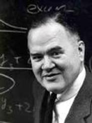
The ideas of John Tukey. John Tukey was a statistician and computer scientist who did a lot of his best work back in the 1960s. Many of his ideas in statistics are about easier and shorter ways to present data sets. We will study three of them, the stem and leaf plot, the five number summary and its graphical representation, the box and whiskers plot.
Stem and leaf plots. If we don't have a lot of duplication, a frequency table is not going to make presenting data any shorter. What Tukey did was split numbers into two parts, the stem and the leaf. The standard way to do this is to make the last digit the leaf and the rest of the number the stem. For example, the number 87 would have stem = 8 and leaf = 7. Tukey's idea was to put the stem numbers at the left and list the leaves from low to high, using a mono-spaced font, which back in the day of typewriters was the only choice available for someone typing. (Courier is a mono-spaced font. The letter i is the same width as the letter w or any other symbol. Most fonts used today aren't mono-spaced anymore, but in this situation, we want to use Courier.)
Here is a list of numbers. It is the number of wins by teams in the American League at the end of the 2008 regular season.
97, 95, 89, 86, 68, 89, 88, 81, 75, 74, 100, 79, 75, 61
The highest number is 100, so we make the stem 10 and the leaf 0. All the numbers on the list are put in stem and leaf form, where the stem is underlined and followed by a |, then the leaves are listed from low to high from left to right.
____
10 | 0
_9 | 57
_8 | 16899
_7 | 4559
_6 | 18
Sometimes data is too spread out to use the last digit as the leaf, and instead the last two digits are the leaf, and we put a space between the two digit leaves for readability. Here is an example. This data set is the number of points scored by the teams in the AFC in the 2008 regular season.
Data set: 347, 448, 388, 440, 234, 298, 394, 367, 223, 244, 364, 350, 342, 356, 309, 317
44 | 08
43 |
42 |
41 |
40 |
39 | 4
38 | 8
37 |
36 | 47
35 | 06
34 | 27
33 |
32 |
31 | 7
30 | 9
29 | 8
28 |
27 |
26 |
25 |
24 | 4
23 | 4
22 | 3
If each stem is a span of ten values, this data is too spread out, but if the stems go from 200 to 299, 300 to 399 and 400-499, the stem and leaf method works very well. When the leaves are two digits, we put a space between them for easier reading.
___
4 | 40 48
3 | 09 17 42 47 50 56 64 67 88 94
2 | 23 34 44 98
Now the data is in a more compact list, and the big idea of stem and leaf, which is not only to give the values but to give the shape of the data, becomes clear. There are only a few values in the 400-499 range, most are between 300 and 399, with some low values in the 200s.
It's possible to have the opposite problem where a stem has too many leaves. Here is the stem and leaf version of the data set we represented with a frequency table earlier.
___
2 | 00
1 | 11111222333334444455666666677777889
0 | 44477899
Obviously, the vast majority of the data is between 10 and 19. It makes sense to make more stems by splitting each category in half, going from 0 to 4, 5 t0 9, 10 to 14, 15 to 19 and 20 to 24. Since there is no data above 25, we don't have to create an empty stem from 25 to 29.
___
2 | 00
1 | 55666666677777889
1 | 111112223333344444
0 | 77899
0 | 444
This shows us that the most common values were between 10 and 14, with 15 to 19 almost as common, with the frequency trailing off as values get above 19 or under 10.
Five number summary. Both frequency tables and stem and leaf plots tell us about all the data. The five number summary, yet another idea of John Tukey, gives us an idea of how the data is distributed, but leaves a lot of information out. The five numbers are the highest value, the lowest value, and three intermediate numbers, Q1, Q2 and Q3. Q stands for quartile, so these numbers are respectively the cut-off points for the bottom 25% of the data, the bottom 50% of the data and the bottom 75% of the data. We already know Q2 by another name, the median. Once we remove the median from a set of data, we then have two new subsets, the bottom half and the top half. Q1 is the median of the bottom half, while Q3 is the median of the top. Let's do an example with a set of data we have already dealt with, the points scored by AFC teams. First, here is the list of 16 numbers put in order from high to low. The middle two values are marked in bold type.
448, 440, 394, 388, 367, 364, 356, 350, 347, 342, 317, 309, 298, 244, 234 223
The median, or Q2 is (350+347)/2 = 348.5.
Top half: 448, 440, 394, 388, 367, 364, 356, 350
The median of the top half, or Q3 is (388+367)/2 = 377.5.
Bottom half: 347, 342, 317, 309, 298, 244, 234 223
The median of the bottom half, or Q1 is (309+298)/2 = 303.5.
In order, the five number summary is:
High: 448
Q3: 377.5
Q2: 348.5
Q1: 303.5
Low: 223
Box and whisker plots: The box and whisker plot is a graphical representation of the five number summary. Each of the five points is plotted against a number line for scale. The area between and is the box, and it represents the middle 50% of the data. The whiskers are lines from the edge of the box to the high and low values. is shown by a dotted line somewher inside the box, though not exactly in the middle, necessarily.
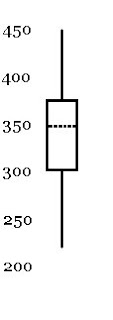
Here is a representation of five number summary above as a box and whisker plot. It could either be on a vertical scale, as pictured here, or it could be represented on a horizontal scale. When financial data from a set of time periods is summarized, the data is often represented with box and whiskers plots, though some websites call them candlesticks instead. The vertical scale represents the value in currency (usually dollars), while the horizontal scale represents the change in time, where the time periods can be any standardized amount, whether day to day or week to week or month to month.
x || f(x)
20 || 2
19 || 1
18 || 2
17 || 5
16 || 7
15 || 2
14 || 5
13 || 5
12 || 3
11 || 5
_9 || 2
_8 || 1
_7 || 2
_4 || 3
We already discussed how to find the mode and median, but what about the mean? We need to find n, and we need to find the sum of all the x values. To get those numbers, n = sum(f(x)) and sum(x) = sum(x*f(x)). Here is the list again with another column of numbers added, the value multiplied by its frequency.
x || f(x) || x*f(x)
20 || 2 || 40
19 || 1 || 19
18 || 2 || 36
17 || 5 || 85
16 || 7 ||112
15 || 2 || 30
14 || 5 || 70
13 || 5 || 65
12 || 3 || 36
11 || 5 || 55
_9 || 2 || 18
_8 || 1 || _8
_7 || 2 || 14
_4 || 3 || 12
The sum of the second column is 45, the sum of the third column is 600, so x-bar=600/45=13.333..., or rounded to the nearest tenth, 13.3.

The ideas of John Tukey. John Tukey was a statistician and computer scientist who did a lot of his best work back in the 1960s. Many of his ideas in statistics are about easier and shorter ways to present data sets. We will study three of them, the stem and leaf plot, the five number summary and its graphical representation, the box and whiskers plot.
Stem and leaf plots. If we don't have a lot of duplication, a frequency table is not going to make presenting data any shorter. What Tukey did was split numbers into two parts, the stem and the leaf. The standard way to do this is to make the last digit the leaf and the rest of the number the stem. For example, the number 87 would have stem = 8 and leaf = 7. Tukey's idea was to put the stem numbers at the left and list the leaves from low to high, using a mono-spaced font, which back in the day of typewriters was the only choice available for someone typing. (Courier is a mono-spaced font. The letter i is the same width as the letter w or any other symbol. Most fonts used today aren't mono-spaced anymore, but in this situation, we want to use Courier.)
Here is a list of numbers. It is the number of wins by teams in the American League at the end of the 2008 regular season.
97, 95, 89, 86, 68, 89, 88, 81, 75, 74, 100, 79, 75, 61
The highest number is 100, so we make the stem 10 and the leaf 0. All the numbers on the list are put in stem and leaf form, where the stem is underlined and followed by a |, then the leaves are listed from low to high from left to right.
____
10 | 0
_9 | 57
_8 | 16899
_7 | 4559
_6 | 18
Sometimes data is too spread out to use the last digit as the leaf, and instead the last two digits are the leaf, and we put a space between the two digit leaves for readability. Here is an example. This data set is the number of points scored by the teams in the AFC in the 2008 regular season.
Data set: 347, 448, 388, 440, 234, 298, 394, 367, 223, 244, 364, 350, 342, 356, 309, 317
44 | 08
43 |
42 |
41 |
40 |
39 | 4
38 | 8
37 |
36 | 47
35 | 06
34 | 27
33 |
32 |
31 | 7
30 | 9
29 | 8
28 |
27 |
26 |
25 |
24 | 4
23 | 4
22 | 3
If each stem is a span of ten values, this data is too spread out, but if the stems go from 200 to 299, 300 to 399 and 400-499, the stem and leaf method works very well. When the leaves are two digits, we put a space between them for easier reading.
___
4 | 40 48
3 | 09 17 42 47 50 56 64 67 88 94
2 | 23 34 44 98
Now the data is in a more compact list, and the big idea of stem and leaf, which is not only to give the values but to give the shape of the data, becomes clear. There are only a few values in the 400-499 range, most are between 300 and 399, with some low values in the 200s.
It's possible to have the opposite problem where a stem has too many leaves. Here is the stem and leaf version of the data set we represented with a frequency table earlier.
___
2 | 00
1 | 11111222333334444455666666677777889
0 | 44477899
Obviously, the vast majority of the data is between 10 and 19. It makes sense to make more stems by splitting each category in half, going from 0 to 4, 5 t0 9, 10 to 14, 15 to 19 and 20 to 24. Since there is no data above 25, we don't have to create an empty stem from 25 to 29.
___
2 | 00
1 | 55666666677777889
1 | 111112223333344444
0 | 77899
0 | 444
This shows us that the most common values were between 10 and 14, with 15 to 19 almost as common, with the frequency trailing off as values get above 19 or under 10.
Five number summary. Both frequency tables and stem and leaf plots tell us about all the data. The five number summary, yet another idea of John Tukey, gives us an idea of how the data is distributed, but leaves a lot of information out. The five numbers are the highest value, the lowest value, and three intermediate numbers, Q1, Q2 and Q3. Q stands for quartile, so these numbers are respectively the cut-off points for the bottom 25% of the data, the bottom 50% of the data and the bottom 75% of the data. We already know Q2 by another name, the median. Once we remove the median from a set of data, we then have two new subsets, the bottom half and the top half. Q1 is the median of the bottom half, while Q3 is the median of the top. Let's do an example with a set of data we have already dealt with, the points scored by AFC teams. First, here is the list of 16 numbers put in order from high to low. The middle two values are marked in bold type.
448, 440, 394, 388, 367, 364, 356, 350, 347, 342, 317, 309, 298, 244, 234 223
The median, or Q2 is (350+347)/2 = 348.5.
Top half: 448, 440, 394, 388, 367, 364, 356, 350
The median of the top half, or Q3 is (388+367)/2 = 377.5.
Bottom half: 347, 342, 317, 309, 298, 244, 234 223
The median of the bottom half, or Q1 is (309+298)/2 = 303.5.
In order, the five number summary is:
High: 448
Q3: 377.5
Q2: 348.5
Q1: 303.5
Low: 223
Box and whisker plots: The box and whisker plot is a graphical representation of the five number summary. Each of the five points is plotted against a number line for scale. The area between and is the box, and it represents the middle 50% of the data. The whiskers are lines from the edge of the box to the high and low values. is shown by a dotted line somewher inside the box, though not exactly in the middle, necessarily.

Here is a representation of five number summary above as a box and whisker plot. It could either be on a vertical scale, as pictured here, or it could be represented on a horizontal scale. When financial data from a set of time periods is summarized, the data is often represented with box and whiskers plots, though some websites call them candlesticks instead. The vertical scale represents the value in currency (usually dollars), while the horizontal scale represents the change in time, where the time periods can be any standardized amount, whether day to day or week to week or month to month.
Tuesday, January 27, 2009
Class notes for 1/26
In earlier classes, we discussed three measures of center.
Mean (average)
Type of data: numerical
Method: add up all the numbers and divide by n (or N), the number of things on the list.
Median
Type of data: numerical or ordered categorical
Method: Put the values in order and find the "middle value" which is the value in position (n+1)/2. If n is odd, there is a single median value on the list. If n is even, there are two middle values on the list, and if numerical, take the average of the two. If the data is categorical and the two values aren't the same, the median lies between two categories.
Mode
Type of data: any data can be used, but only if there are duplicate values on the list.
Method: Find the most common value. If there is a tie for most common, there can be more than one mode.
A fourth measure of center was introduced, the mid-range.
Mid-range
Type of data: numerical
Method: (high + low)/2
Sensitivity to outliers: Mid-range is especially sensitive to outlying values, which means values much higher than the rest of the data or much lower than most of the data. Mean is also sensitive, but not as sensitive. Median and mode are not sensitive to outliers at all.
When we should and shouldn't use average: Some types of numerical data do not give useful information when we take the average.
Coded numerical: Usually, with numbers there is a meaning we can give to the ideas of "more" and "less". With coded data, we don't necessarily have that. Examples are zip codes, social security numbers and driver's licenses. Finding the average zip code of a group of people is meaningless, though finding the mode means that is the most popular of the possible zip codes.
Ordinal data: Here, the idea of a > b has meaning, but the distance between units isn't the same. In a ranking system, it's better to be first than it is to be second, but we can't say how much better, and we don't know if the difference between first and second is the same as the distance between second and third.
Often, when we switch from an ordered categorical system like grades (A, B, C, D, F) to the numbers used for grade points (4.0, 3.0, 2.0, 1.0, 0.0), the choice of what numbers to use is arbitrary. Is the distance from an A to B really the same as the distance from a C to a D? Is getting an A in one class and a C in another really the same as getting two Bs, since both would be a 3.0 Grade Point Average (GPA). How about 2 As and a D, which is 3.0, or 3 As and an F? Should all those situations be counted the same way?
Interval data: This is the minimum requirement need for mean to make sense, the idea that the distance between two numbers, a - b, has a consistent meaning, like degrees in temperature readings or the number of strokes taken to complete a round of golf. In these system, the number zero does not mean the complete absence of a thing, so it dividing one number by another from the data set doesn't give meaningful information, but taking and average is about adding values together and dividing by the number of values, so an average temperature or an average of the scores in four rounds of golf does produce a useful statistic.
Rational data: This is data where not only a - b means something, but also a/b. The difference between interval and rational data is the meaning of the number zero. If zero indicates the complete lack of a thing, then we can talk about something between twice as much as another thing, or 10% less. A lot of numerical systems of measurement are rational, but not all.
===
Frequency tables
When we have a lot of repetition in a set of data, a way to write the information more compactly is a frequency table, where a value (either categorical or numerical) is followed by the number of times it shows up in a data set. Here is an example, where we will call the values x and their frequencies f(x).
x || f(x)
20 || 2
19 || 1
18 || 2
17 || 5
16 || 7
15 || 2
14 || 5
13 || 5
12 || 3
11 || 5
_9 || 2
_8 || 1
_7 || 2
_4 || 3
Because there is so much duplication this is much easier to read than 20, 20, 19, 18, 18, 17, 17, 17, 17, 17, etc.
Finding the mode: Whichever value corresponds to the highest frequency is the mode. (Data with no mode would have all frequencies equal to 1, and it would not be a good candidate for being representing as a frequency table.) In the example above, the value 16 shows up seven times, more than any other, so it clearly is the mode.
Finding the median: If we add up all the frequencies, we get n. We need to find (n+1)/2, and figure out which value is in that position. In the data above, n = 45, so the thing in position 23 is the median. We can put the positions of all the data on the list as follows.
x || f(x)
20 || 2 positions 1-2
19 || 1 position 3
18 || 2 positions 4-5
17 || 5 positions 6-10
16 || 7 positions 11-17
15 || 2 positions 18-19
14 || 5 positions 20-24
13 || 5
12 || 3
11 || 5
_9 || 2
_8 || 1
_7 || 2
_4 || 3
This means position 23 is in the middle of a string of values = 14, and 14 is the median.
Next class, we will show how to get an average using a frequency table.
Mean (average)
Type of data: numerical
Method: add up all the numbers and divide by n (or N), the number of things on the list.
Median
Type of data: numerical or ordered categorical
Method: Put the values in order and find the "middle value" which is the value in position (n+1)/2. If n is odd, there is a single median value on the list. If n is even, there are two middle values on the list, and if numerical, take the average of the two. If the data is categorical and the two values aren't the same, the median lies between two categories.
Mode
Type of data: any data can be used, but only if there are duplicate values on the list.
Method: Find the most common value. If there is a tie for most common, there can be more than one mode.
A fourth measure of center was introduced, the mid-range.
Mid-range
Type of data: numerical
Method: (high + low)/2
Sensitivity to outliers: Mid-range is especially sensitive to outlying values, which means values much higher than the rest of the data or much lower than most of the data. Mean is also sensitive, but not as sensitive. Median and mode are not sensitive to outliers at all.
When we should and shouldn't use average: Some types of numerical data do not give useful information when we take the average.
Coded numerical: Usually, with numbers there is a meaning we can give to the ideas of "more" and "less". With coded data, we don't necessarily have that. Examples are zip codes, social security numbers and driver's licenses. Finding the average zip code of a group of people is meaningless, though finding the mode means that is the most popular of the possible zip codes.
Ordinal data: Here, the idea of a > b has meaning, but the distance between units isn't the same. In a ranking system, it's better to be first than it is to be second, but we can't say how much better, and we don't know if the difference between first and second is the same as the distance between second and third.
Often, when we switch from an ordered categorical system like grades (A, B, C, D, F) to the numbers used for grade points (4.0, 3.0, 2.0, 1.0, 0.0), the choice of what numbers to use is arbitrary. Is the distance from an A to B really the same as the distance from a C to a D? Is getting an A in one class and a C in another really the same as getting two Bs, since both would be a 3.0 Grade Point Average (GPA). How about 2 As and a D, which is 3.0, or 3 As and an F? Should all those situations be counted the same way?
Interval data: This is the minimum requirement need for mean to make sense, the idea that the distance between two numbers, a - b, has a consistent meaning, like degrees in temperature readings or the number of strokes taken to complete a round of golf. In these system, the number zero does not mean the complete absence of a thing, so it dividing one number by another from the data set doesn't give meaningful information, but taking and average is about adding values together and dividing by the number of values, so an average temperature or an average of the scores in four rounds of golf does produce a useful statistic.
Rational data: This is data where not only a - b means something, but also a/b. The difference between interval and rational data is the meaning of the number zero. If zero indicates the complete lack of a thing, then we can talk about something between twice as much as another thing, or 10% less. A lot of numerical systems of measurement are rational, but not all.
===
Frequency tables
When we have a lot of repetition in a set of data, a way to write the information more compactly is a frequency table, where a value (either categorical or numerical) is followed by the number of times it shows up in a data set. Here is an example, where we will call the values x and their frequencies f(x).
x || f(x)
20 || 2
19 || 1
18 || 2
17 || 5
16 || 7
15 || 2
14 || 5
13 || 5
12 || 3
11 || 5
_9 || 2
_8 || 1
_7 || 2
_4 || 3
Because there is so much duplication this is much easier to read than 20, 20, 19, 18, 18, 17, 17, 17, 17, 17, etc.
Finding the mode: Whichever value corresponds to the highest frequency is the mode. (Data with no mode would have all frequencies equal to 1, and it would not be a good candidate for being representing as a frequency table.) In the example above, the value 16 shows up seven times, more than any other, so it clearly is the mode.
Finding the median: If we add up all the frequencies, we get n. We need to find (n+1)/2, and figure out which value is in that position. In the data above, n = 45, so the thing in position 23 is the median. We can put the positions of all the data on the list as follows.
x || f(x)
20 || 2 positions 1-2
19 || 1 position 3
18 || 2 positions 4-5
17 || 5 positions 6-10
16 || 7 positions 11-17
15 || 2 positions 18-19
14 || 5 positions 20-24
13 || 5
12 || 3
11 || 5
_9 || 2
_8 || 1
_7 || 2
_4 || 3
This means position 23 is in the middle of a string of values = 14, and 14 is the median.
Next class, we will show how to get an average using a frequency table.
Subscribe to:
Posts (Atom)

